CSS - transform / animation 본문
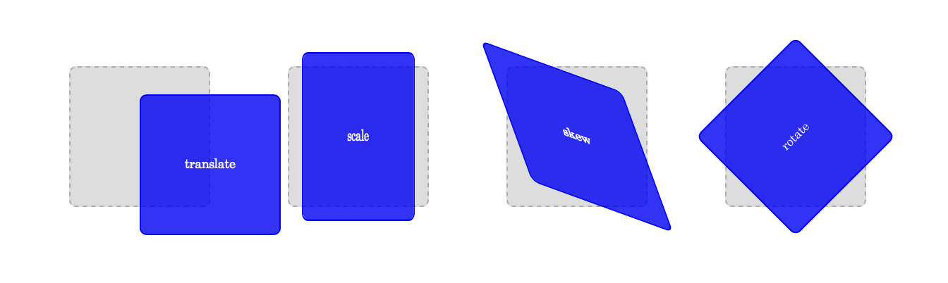
transform
변형, 요소 이동, 회전, 확대축소, 비틀기 등 효과 줄 수 있음
속성 값 :
translate(x,y) 요소를 좌표만큼 움직일 수 있음 / translateX(x)
scale(x,y) 요소를 축소 혹은 확대
skew (x-angle, y-angle) 요소를 기울임 / ex) skew(15deg, 10deg)
rotate(angle) 요소를 n만큼 회전시킴 / 시계방향 기준
.target1 {
    transform: translate(50%, 20%);
}
.target2 {
    transform: scale(0.8, 1.2);
}
.target3 {
    transform: skew(20deg, 20deg);
}
.target4 {
    transform: rotate(-45deg);
}
transform은 변환 함수를 중첩 적용시키는 것이 가능한 속성임
공백을 줄 때는 띄어쓰기 활용
transition과 transform
transform을 활용한 예제
각 글자마다 다른 딜레이 시간을 적용시켰음

animation
여러 이미지를 연결해서 자연스럽게 움직이는 것처럼 보이게 만드는 기법
1. transiton 속성 활용 / 특정한 이벤트를 기점으로 작동(hover)
2. animation 속성과 keyframe 활용 / 시작하기 위한 이벤트가 필요 없음. 시작, 정지, 반복까지 제어할 수 있음
@keyframes 로 애니메이션 정의한 뒤, 정의한 애니메이션을 불러와서 제어
상대적으로 사용이 복잡하다 보니, transition으로 안되는 경우 활용
@keyframes 작성방법
animaitonName : 애니메이션 이름
from || 0% : 시작시점
to || 100% : 종료시점
@keyframes animationName {
	from {
    	left: 0;
	}
	to {
    	left : 200px;
	}
}
animation 관련 속성들
name : 어떤 요소에 적용할 것인지 지정
duration : 애니메이션 한 번 재생하는데 걸리는 시간 설정 / 2s
direction : 재생 방향 정의(정방향 || 역방향) / normal, reverse, alternate(정방향 -> 반복시 정방향 역방향) <-> alternate-reverse
iteration-count : 재생 횟수를 정의 / infinite, 2
timing-function : 애니메이션 재생 패턴을 정의 / ease-in-out
delay : 애니메이션 시작을 얼마나 지연할 지 설정 / 2s
animation 단축 속성
animation: name duration timing-function delay iteration-count direction
animaiton: moveRight 0.4s linear 1s infinite alternate
애니메이션 활용 예제
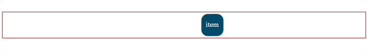
.item {
    width: 100px;
    height: 100px;
    background-color: blue;
    display: flex;
    flex-direction: row;
    justify-content: center;
    align-items: center;
    font-size: 30px;
.item {
	- 중략 -
    position: absolute;
    animation: moveBox 1s ease-in-out infinite alternate;
}

@keyframes moveBox {
    from {
        border-radius: 0;
        left: 0;
        background-color: blue;
        transform: scale(1);
    }
    to {
        border-radius: 50%;
        left: calc(100% - 100px);
        background-color: green;
        transform: scale(0.75);
    }
}
예제로 나온 것은 아니지만, 재밌을 것 같아서 만들어본 비 내리는 애니메이션
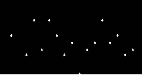
원래는 예제와 같은 방식으로 무지개를 만들어볼까 하다가, 작업 중간에 바꿨다
nth-of-type 덕분에 각각의 요소에 클래스를 적용시키지 않아도 되긴 했지만,
복붙해야하고 또 일일히 수정해야한다는 점은 역시 번거로웠다.
.rainbowPlate {
    width: 150px;
    height: 50px;
    display: flex;
    flex-direction: row;
    justify-content: center;
    align-items: center;
    color: white;
    font-weight: 400;
    position: absolute;
    animation: rainBow 1s ease-in-out infinite normal;
}
@keyframes rainBow {
    0% {
        top: 0px;
    }
    80% {
        opacity: 1;
    }
    100% {
        top: calc(95%);
        opacity: 0;
    }
}
.rainbowPlate:nth-of-type(2){
    left: 100px;
    animation-duration: 0.9s;
}
.rainbowPlate:nth-of-type(3){
    left: 150px;
    animation-duration: 1.1s;
}
.rainbowPlate:nth-of-type(4){
    left: 200px;
    animation-duration: 0.8s;
}
-- 중략 --
팀원들과 함께한 스프린트9

함께 할 때는 바로바로 코드가 떠올랐던 것 같은데,
막상 혼자 다시 해보려니까 버벅이는 듯한 느낌을 받았다
혼자 연습하는 것 역시 중요하다는 것을 깨닫는 오늘
'개발 > HTML CSS' 카테고리의 다른 글
| 반응형 웹페이지 만들기 (진행상황 수정)- 닉슨 (0) | 2022.12.24 |
|---|---|
| css - 그리드 / 반응형 웹 (0) | 2022.12.23 |
| css - cascading / background / transition (1) | 2022.12.21 |
| css - 정렬 (0) | 2022.12.21 |
| css - 선택자(child, nth) / 정렬 (0) | 2022.12.21 |


